Lite and Pro overlap more than their names suggest. Lite already reasons, edits, and builds information-rich images; Pro raises the emphasis on professional layout, guided editing, photographic finish, and multilingual production.
That makes a generic ‘Lite for drafts, Pro for final work’ answer too neat. In our four matched first-output tests, Pro produced the more polished infographic and a slightly stronger product scene, but it did not prove more reliable with multilingual text. Both models also missed an explicit background-color instruction in the reference edit.
Pro has a finish edge, not a universal quality lead.
Across these four first outputs, the useful split is visual finish versus literal instruction reliability—and every image with production text still needs review.
Lite remains a credible first pass
Lite copied the complete infographic brief, produced a convincing material study, and preserved the reference product. Its simpler layouts and 3K option may be useful, but its multilingual poster still changed the Japanese line and added repeated pseudo-marks.
Pro is stronger when finish drives the decision
Pro gave the infographic a clearer editorial flow, edged ahead on product-scene finish, and kept the reference framing slightly closer. It still dropped the requested Japanese line and missed the cobalt-blue reference-edit background.
Official capability and product access are different questions.
The first two columns summarize ByteDance's public model positioning. The final column states what a visitor can actually do in Dreammmer today.
Two releases with overlapping foundations and different emphasis.
Lite is not a bare-bones generator, and Pro is not simply a resolution upgrade. Their official pages describe different priorities on top of a broad multimodal creation workflow.
Seedream 5.0 Lite
ByteDance presents Lite as a unified multimodal image model built to understand intent before it draws.
- Cross-modal understanding and multi-step visual reasoning.
- World knowledge for diagrams, education, and office work.
- Online search for time-sensitive creative requests.
- Style transfer, targeted edits, and multi-subject prompts.
Seedream 5.0 Pro
ByteDance presents Pro as a multimodal model for efficient creation and professional production.
- Dense information graphics and structured visual systems.
- Spatially guided editing and sketch-based control.
- More realistic light, materials, skin, and portraits.
- Native multilingual prompting and in-image typography.
What Pro puts at the center
These are the four official Pro capability groups this comparison can test or clearly mark as outside the current Dreammmer interface.
High-density infographics
Pro is positioned for text-heavy diagrams, professional information graphics, storyboards, and interface-like layouts.
Interactive editing
The full model supports spatial annotations, sketches, and layer separation. Dreammmer currently tests prompt-led editing with one reference image instead.
Photographic visual quality
The release highlights physical lighting, shadows, skin texture, reflections, refraction, and natural portrait detail.
Native multilingual generation
Pro is positioned for multilingual prompts and readable text across international creative workflows.
Change the model. Hold everything else still.
Each case uses the same prompt, 2K resolution, aspect ratio, source image when required, one output, and no post-processing. The Pro file is shared with the separate Pro review; only the matching Lite file is additional work.
We keep the first returned image from each model. No prompt repair, hidden reruns, or cherry-picked gallery result. If one model misunderstands the brief, that failure belongs in the comparison.
4 briefs, 8 matched outputs
The eight images below are the first returned outputs from the fixed prompts. Each pair uses the same 2K setting, ratio, and source image where required, with no prompt repair or post-processing.
Which model keeps a dense brief readable?
This is an exact-copy and hierarchy test. A polished-looking poster still fails if it changes the supplied words, loses a numbered step, or adds decorative pseudo-text.
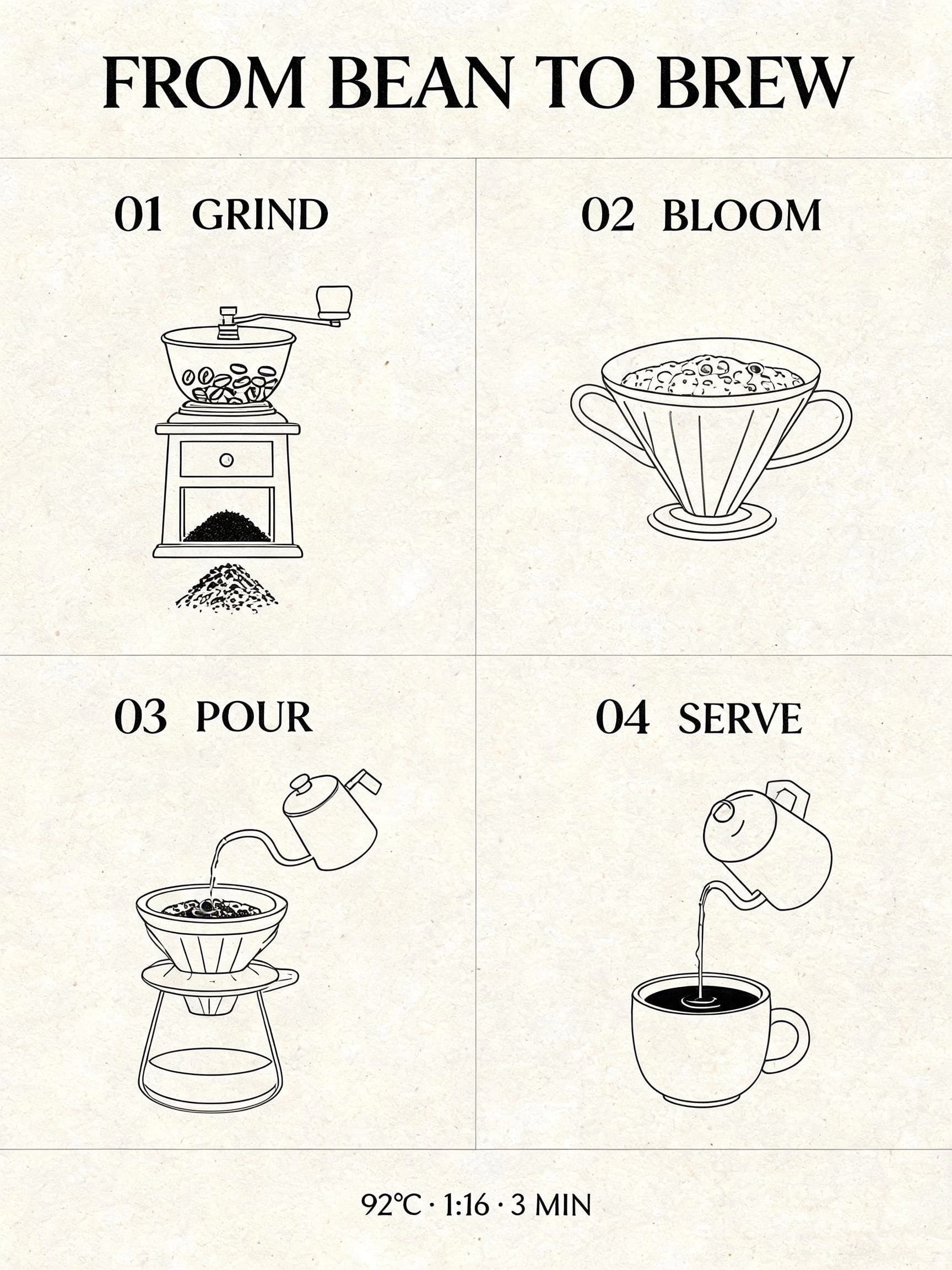
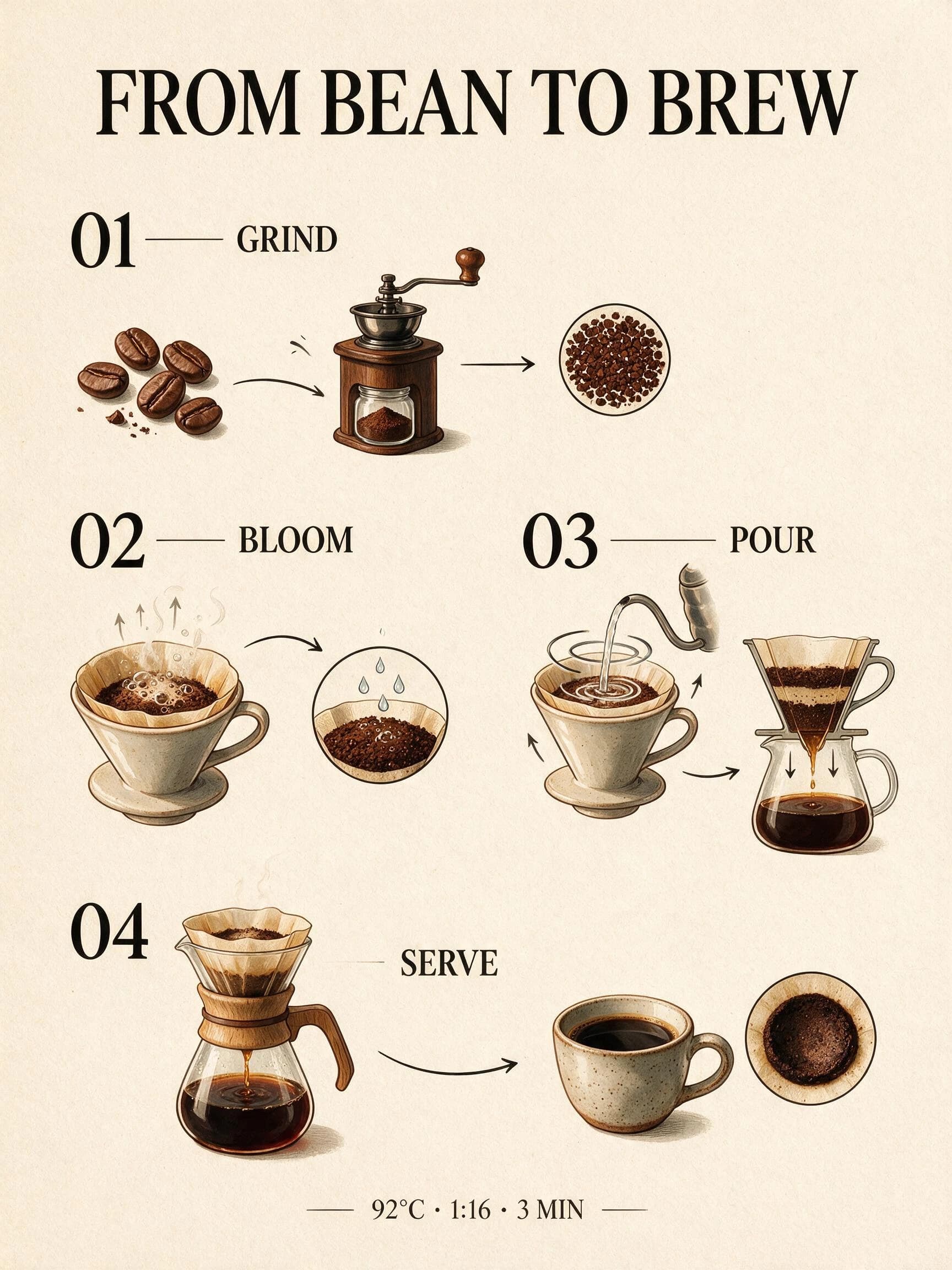
Copy accuracy is a draw; Pro has the layout edge.
Both outputs preserve the title, four numbered steps, order, and footer exactly. Lite uses the more literal 2×2 grid, while Pro turns the process into a stronger editorial sequence with richer illustrations. Neither follows the request for cobalt-blue diagrams.
All required copy is correct and easy to scan. The composition is plain but literal; its diagrams are black rather than cobalt blue.
All required copy is correct. The visual flow and illustrations are more developed, but the diagram color is brown and black rather than cobalt blue.
Design a vertical editorial infographic titled "FROM BEAN TO BREW". Use exactly four numbered sections: "01 GRIND", "02 BLOOM", "03 POUR", "04 SERVE". Add one footer line: "92°C · 1:16 · 3 MIN". Warm ivory paper, cobalt blue diagrams, black serif typography, clear spacing, no extra words, no logos, no watermark.
Test setup
Do not upload a reference image. Generate once with Lite and once with Pro at 2K, 3:4, one output. Keep the prompt unchanged.
Scoring criteria
- All supplied headings and the footer line are transcribed correctly.
- The four steps appear once and in the requested order.
- The layout remains readable at article width.
- No extra pseudo-text, logo, or watermark appears.
Which model separates glass, liquid, metal, and stone?
The same small product scene tests whether polished visual quality comes from believable material behavior rather than a glossy filter.
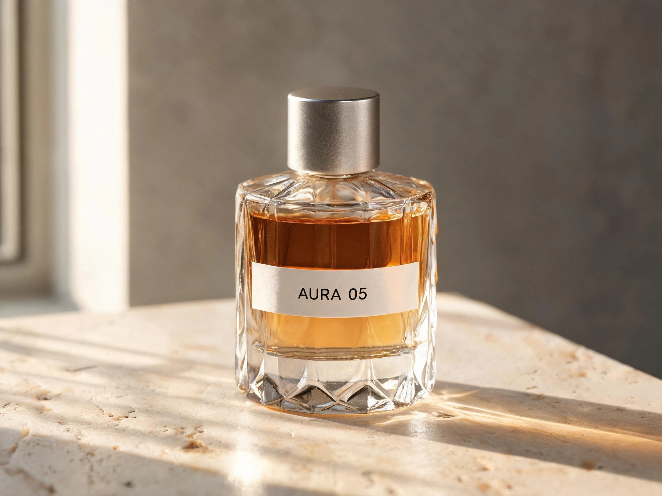
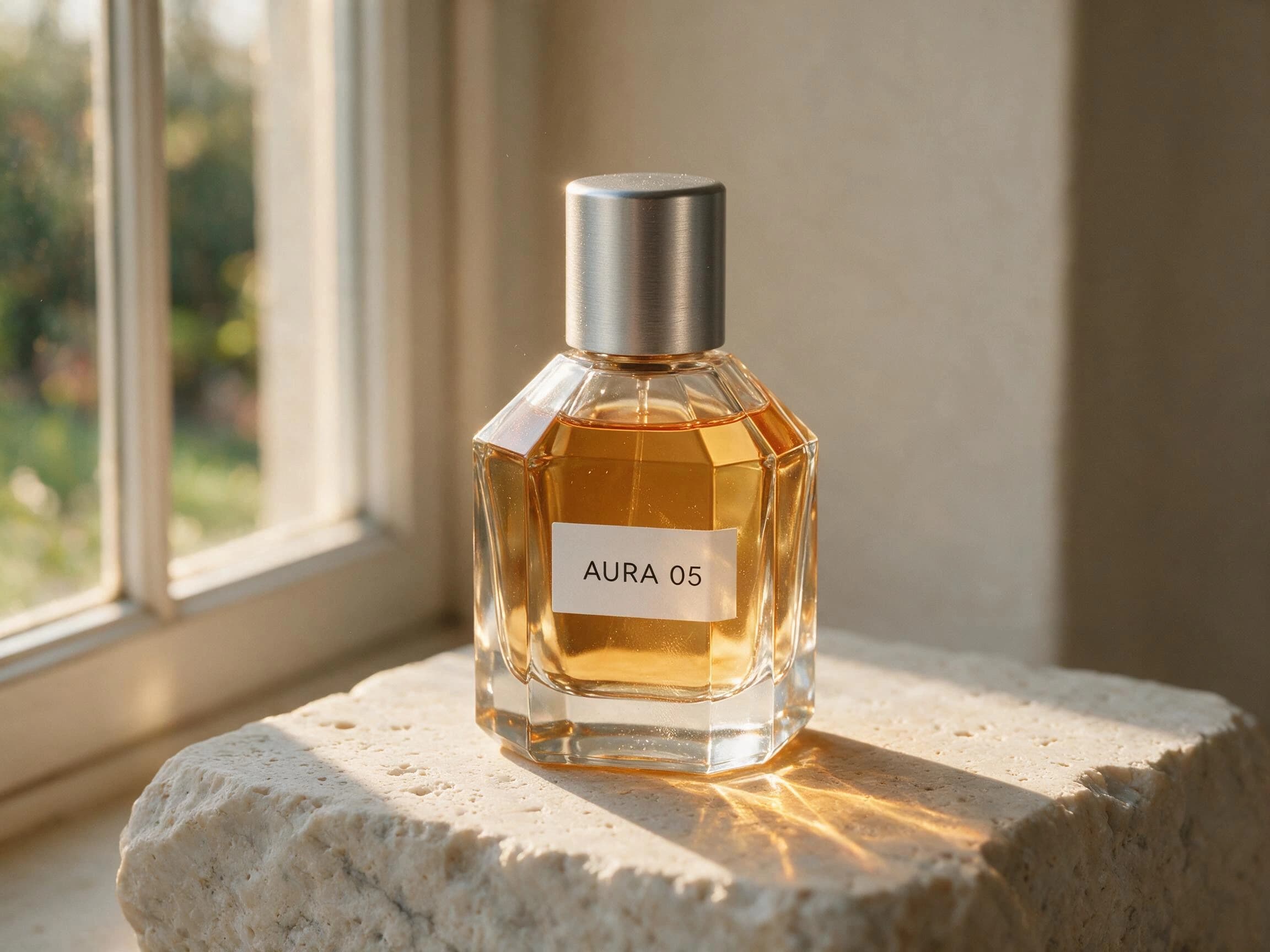
Both pass the core brief; Pro has a narrow finish edge.
Both models render the exact AURA 05 label, distinct glass, amber liquid, brushed metal, travertine, and believable contact. Pro uses negative space and the light path more cohesively; Lite gives the bottle a crisper, closer product view. The difference is modest in this single run.
The label is exact, the faceted glass reads clearly, and the bottle sits convincingly on the stone. The close crop is less restrained than Pro's.
The label is exact, the materials separate cleanly, and the side light produces coherent caustics and shadow. The framing feels more editorial.
Create a premium studio product photograph of an original unbranded perfume bottle labeled exactly "AURA 05". Clear faceted glass, amber liquid, brushed aluminum cap, placed on pale travertine. Late afternoon side light through a narrow window, realistic caustics, refraction, contact shadow, subtle dust and fingerprints, restrained editorial composition, no additional text, no logo, no watermark.
Test setup
Do not upload a reference image. Generate once with Lite and once with Pro at 2K, 4:3, one output. Keep the prompt unchanged.
Scoring criteria
- The label reads AURA 05 and does not acquire extra brand copy.
- Glass, amber liquid, aluminum, and travertine remain distinct.
- Reflections, caustics, and shadows agree with the light direction.
- The bottle rests convincingly on the surface.
Which model keeps five scripts intact?
This case judges transcription before aesthetics. Every language must survive one shared layout without substitutions, missing marks, or decorative gibberish.
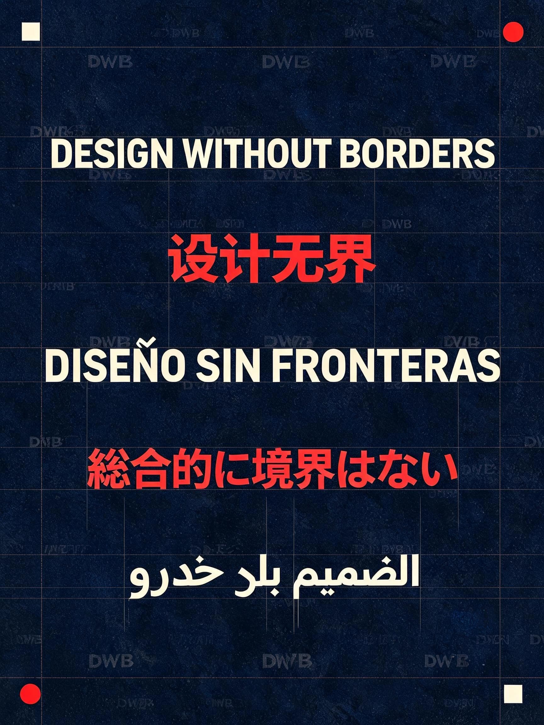
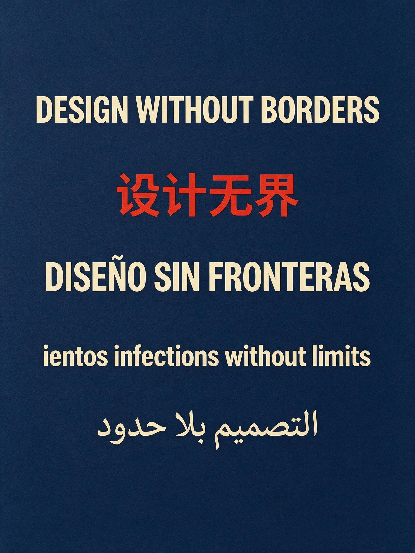
Neither output is safe for production typography.
Both images keep the English, Chinese, Spanish, and Arabic lines legible, but both fail the exact Japanese requirement. Lite substitutes a different Japanese phrase and fills the background with repeated DWB pseudo-marks. Pro drops the Japanese line and replaces it with garbled Latin copy. This test has no winner.
Four requested lines are correct. The Japanese copy is changed, and repeated DWB-like marks violate the no-extra-text and no-watermark requirements.
Four requested lines are correct. The Japanese line is missing and a garbled Latin line appears in its place, so the poster fails exact transcription.
Create a vertical typographic poster on deep navy paper. Set these five lines exactly as written, each once, with generous spacing: "DESIGN WITHOUT BORDERS", "设计无界", "DISEÑO SIN FRONTERAS", "デザインに境界はない", "التصميم بلا حدود". Use cream and vermilion ink, modern editorial grid, keep every character legible, no extra words, no logo, no watermark.
Test setup
Do not upload a reference image. Generate once with Lite and once with Pro at 2K, 3:4, one output. Keep the prompt unchanged.
Scoring criteria
- Each supplied line appears exactly once.
- Spanish accents and Japanese characters remain intact.
- Arabic joins correctly and reads right to left.
- No model invents supporting copy or extra letters.
Which model changes the set without redesigning the product?
Both models receive the same source image and preservation rules. The useful result changes the background and light while leaving the product identity alone.
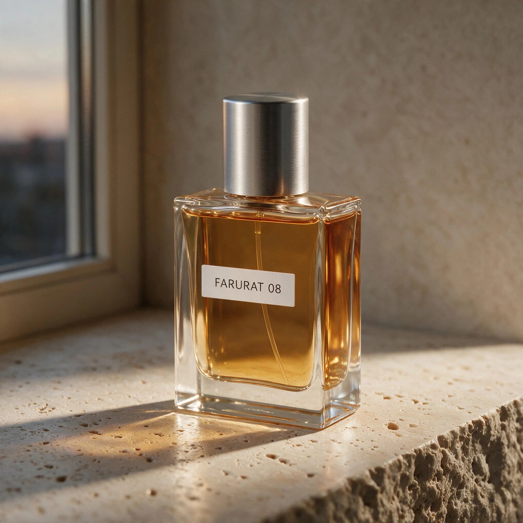
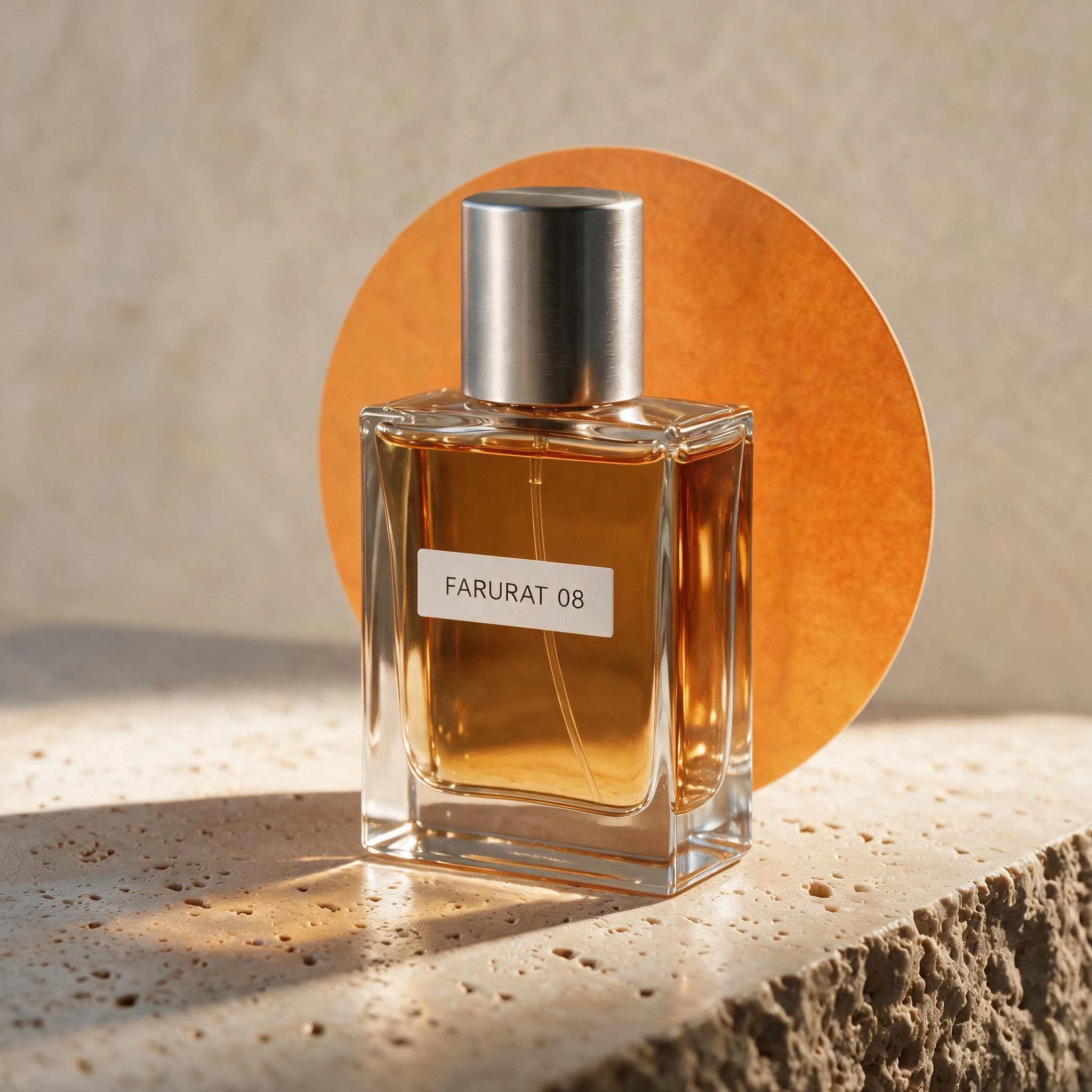
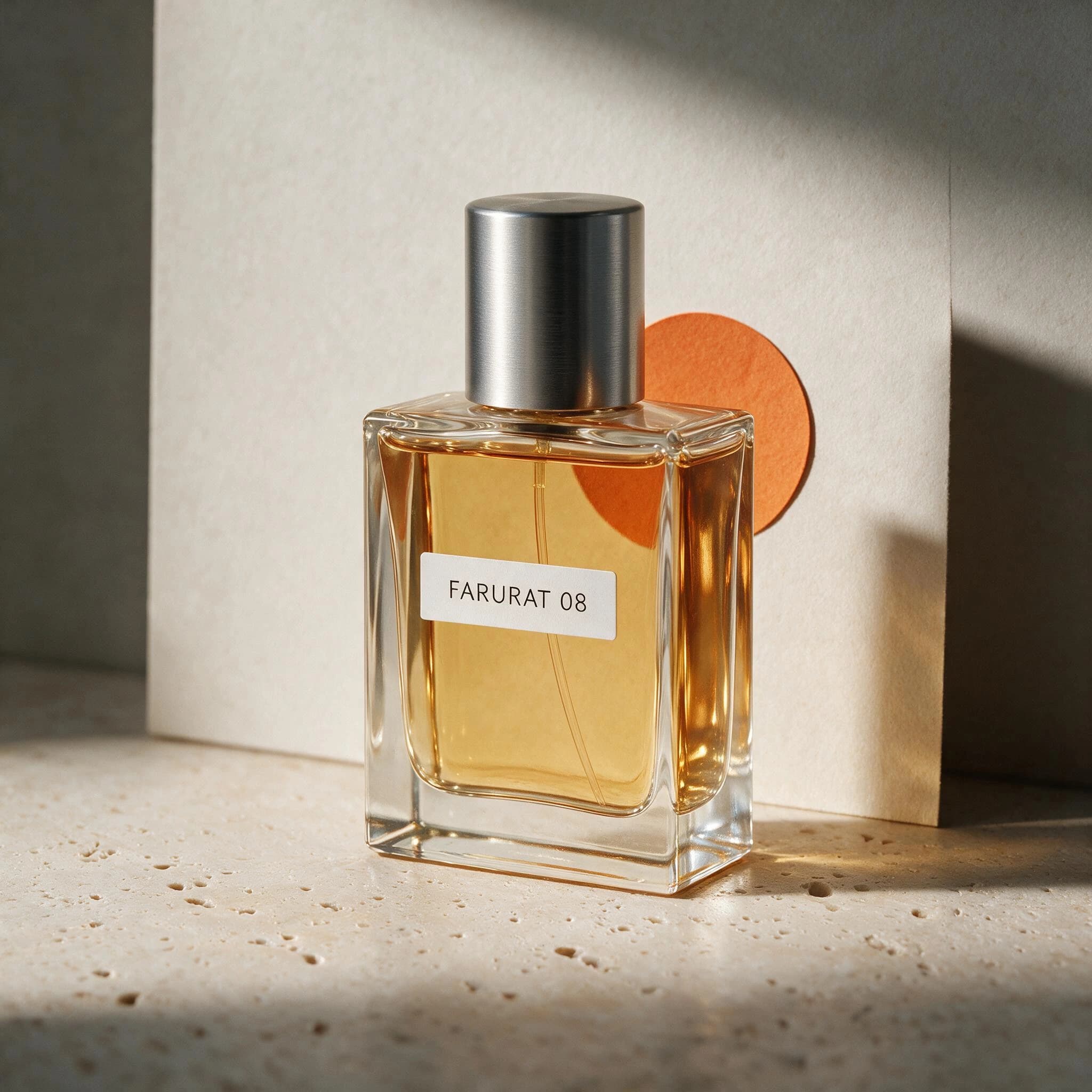
Pro preserves the framing more closely; both miss the blue set.
Both edits preserve the FARURAT 08 label, rectangular bottle, amber liquid, metal cap, and overall product identity. Pro stays slightly closer to the source scale and position; Lite enlarges the orange circle and changes the crop more. Neither model creates the requested cobalt-blue studio background, so neither fully passes.
Product identity and label remain intact, but the bottle is reframed and the orange circle dominates the set. The background stays neutral instead of cobalt blue.
The bottle scale, position, label, and silhouette stay closer to the source. The set still uses a neutral wall rather than the requested cobalt blue.
Preserve the product's exact silhouette, proportions, label placement, and primary color from the reference image. Replace only the background with a quiet cobalt-blue studio set, add a small warm orange paper circle behind the product, and change the lighting to soft left-side window light. Keep the camera angle and product position unchanged. Do not add objects, text, logos, or watermark.
Test setup
Upload the same square, user-owned, trademark-free product image for both runs. Generate once with Lite and once with Pro at 2K, 1:1, one output. Keep the prompt unchanged.
Scoring criteria
- Silhouette, proportions, label placement, color, angle, and position stay close to the source.
- Only the requested set, paper circle, and lighting change.
- Neither output adds props, text, or a new logo.
- Product edges and contact shadows remain coherent.
Who should choose Lite, and who should choose Pro?
These recommendations combine the official positioning, current Dreammmer controls, and the four matched first-output results above.
Start with Lite when literal structure matters
Lite is a credible first pass when a simpler layout, 3K output, or lower visual-production pressure matters more than maximum polish.
- Concept exploration and knowledge-led visual briefs.
- Explanatory graphics where clear structure beats decorative detail.
- Creators who need Dreammmer's 3K option.
- Users willing to inspect every line of generated production text.
Start with Pro when finish drives the brief
Pro is the stronger first choice when editorial hierarchy, product-scene composition, or closer reference framing affects usability.
- Campaign graphics, product scenes, and client-facing visuals.
- Dense information design that benefits from a stronger visual sequence.
- Material, lighting, and photographic-finish checks.
- Reference edits where product scale and position need close review.
Full-model capability is not the same as this website's toolset.
Dreammmer currently offers text-to-image, one optional JPG or PNG reference, supported ratios, one to four outputs, generation history, preview, and download. It does not expose point selection, lasso tools, an annotation canvas, multi-reference input, or editable layer export.
What the four matched tests actually answer
The answers below separate visible first-output evidence from claims this small test cannot support.
Is Seedream 5.0 Pro always better than Lite?
No. Pro produced the more polished infographic, a slightly stronger product scene, and the closer reference framing in this test. Lite still matched the infographic copy and produced credible material and editing results. Both models failed the exact multilingual brief, and both missed the cobalt-blue edit instruction.
Is Lite faster or cheaper in Dreammmer?
Both models currently cost 10 credits per generated image in Dreammmer. These four pairs do not provide enough repeated timing data to claim a reliable speed difference.
Which model should I trust for text inside an image?
Neither without review. Both models copied the English infographic brief exactly, but both failed the five-script poster. Use generated text as a draft, zoom in, compare every character with the source copy, and regenerate or typeset it manually when accuracy is non-negotiable.
Which model handled the reference edit better?
Pro kept the product scale and position slightly closer to the source. Both models preserved the label and product identity, but both ignored the requested cobalt-blue set, so neither output fully passed the edit brief.
Test the model against your own acceptance criteria.
Keep the prompt, ratio, and resolution fixed, compare the first outputs, and review text and preservation details before choosing a production model.